Had a play around with this nice tool for creating website graphs a few weeks ago. Very pretty, and it’s a nice way to see how simple or complicated your markup is.
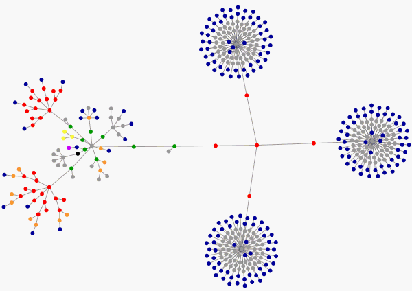
Now Gary has posted about this, I thought I’d put a screenshot of the Carsurvey.org Home Page up for people to see:

I’m rather proud of the relative simplicity of my graph. The key features being the three lists of manufacturers, which make up the large blue and grey circular objects. Those should really be one list, but it’s difficult to split a single list into three columns without using some hairy markup.