Monthly Archives: June 2006

Search the Carsurvey.org Airline reviews

Following on from the Improved Carsurvey.org Search, I’ve now ported this functionality to the airline reviews site.

The old Google search solution used by the other sites wasn’t an option for the airline site (as it sits within the Carsurvey.org domain, rather than under its own domain name), but this new searching system doesn’t have such constraints, so at long last, the airline site is now properly searchable.

Further Carsurvey.org Layout changes

Apologies to anyone getting sick of these…

I haven’t had any feedback on the other changes made recently, and the figures are ambiguous, so I’ve made a change to the reviews pages only, in an attempt to find an optimal layout.

I’ve restored the similar reviews box, and altered the advertising placement slightly.

Improved Carsurvey.org Search

I’ve spent some more time working on the new search functionality:

  • Keywords in results are now highlighted as bold text
  • Matching fragments of reviews and comments are shown, rather than just the review summary text
  • Less results per page are shown, as each result tends to be larger due to the above changes
  • I’ve decreased the maximum limit of results from 200 to 100. This is to counteract the increased work load generated by matching the keywords and fragments

Much as I’m very impressed with MySQL Fulltext Searching, it doesn’t offer the facility (at least in Version 4) to extract the matching text from results sets. I’ve had to do it myself in PHP using regular expressions. Not a big deal, but it did feel a little like I was having to reinvent the wheel.

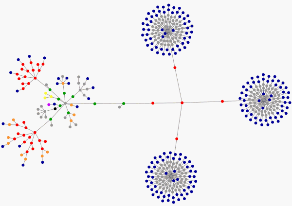
The Carsurvey.org Home Page as a Graph

Had a play around with this nice tool for creating website graphs a few weeks ago. Very pretty, and it’s a nice way to see how simple or complicated your markup is.

Now Gary has posted about this, I thought I’d put a screenshot of the Carsurvey.org Home Page up for people to see:

I’m rather proud of the relative simplicity of my graph. The key features being the three lists of manufacturers, which make up the large blue and grey circular objects. Those should really be one list, but it’s difficult to split a single list into three columns without using some hairy markup.

A sprinkling of small changes to Carsurvey.org

Not feeling too well at the moment (Hay Fever), so have spent the afternoon making a series of simple changes, mostly to make things more consistent across the site:

  • The new reviews and comments pages now use the new date formatting (minutes, hours, days, or weeks ago), rather than showing the database datetime stamp (which was pretty meaningless)
  • The various geographic new reviews and comments pages, along with the pages that display reviews by type, or comments by volume, have been changed to the full width layout currently used on the reviews and comments pages. This should make better use of the available space. The global new reviews and comments pages are unchanged
  • I’ve disabled the descriptive text that was present for some models. It hasn’t been updated for ages, and Wikipedia does a better job of documenting car model histories than I ever could. Better to not do something than do it badly.

New Search Functionality

I’ve been having trouble finding a good location to fit the Google search box on Carsurvey.org. The recent changes to the site layout that I’ve made seem to be working well, but search volumes were down, which I have taken to be a bad sign.

In order to get more flexibility in terms of the placement of the search box, I’ve replaced the Google search box with a new search box, backended with some new search functionality I’ve written, based on MySQL Fulltext Search. This has advantages and disadvantages compared to using Google:

Disadvantages of the new solution:

  • It doesn’t current show snippets of the matching text in the results
  • There are no Google adverts, which were a small revenue stream for the site
  • Parts of the site other than the reviews and comments are not searchable
  • It can’t spot spelling errors
  • There is no rich syntax like Google offers
  • In order to increase performance, the search is limited to a max of 200 results. The search doesn’t compute the maximum number of results if there are more than 200. Interestingly, Google themselves only show about 1000 results, even when they find a lot more. For queries with thousands of results, Google state “about” how many they have found. So I doubt they are calculating that part of the result in real time

Advantages of the new solution:

  • It’s fast. As long a query limit is in place stop it trying to return 20,000 results, MySQL Fulltext Search seems to fly. And there’s no need to do a DNS lookup for Google
  • It’s complete and up-to-date – no need to wait for any spider to visit the site
  • Comments that are found are linked to directly using an HTML anchor
  • The new search looks specifically for model and manufacturer searches, and displays special results at the top of the page for these common cases
  • More control over the look and feel of the search box and results
  • No adverts

Just in case anyone misses the Google Search, I’ve placed a Google box at the bottom of the search results page. So you still have the choice to use Google if my new search is not delivering good results.

This change has allowed me to move the search box across to the left of the page. Hopefully it will be more obvious to visitors there.

While making this change, a few other minor issues were addressed. In particular, some margins have been changed from being in pixels to em units. This makes the site look nicer with large fonts.

As usual, any feedback is welcome.